
The season of fall inspired Vincent van Gogh's art experience starting from his early years as an artist. This painting showcases his remarkable command of linear perspective, depicting a long tree-lined road in front of a farmhouse. Wagon tracks are just barely visible in the dirt, indicating that someone has recently left. Perhaps the figure walking in the foreground is trying to catch up? By capturing the colors and vividness of fall in his paintings, van Gogh explored the possibilities of color theory. The same year this picture was painted, van Gogh visited the National Gallery in London. There, he saw a similar painting, The Avenue at Middelharnis by 17th-century Dutch artist Meindert Hobbema, which served as a source of inspiration and motivation for this work. Van Gogh’s admiration and respect for other fall paintings were a result of his dedication to exploring new possibilities in the art world.
Fall: An Inspiration Full of Colors

Vincent van Gogh, a name synonymous with post-impressionist masterpieces, had a profound connection with the colors of nature, especially the vibrant hues of fall. From the onset of his artistic journey, the autumnal palette deeply influenced his works, leading to creations that showcased not only his technical prowess but also his emotional resonance with the season. One such painting, depicting a tree-lined road stretching towards a farmhouse, is a testament to van Gogh's mastery of linear perspective. The faint traces of wagon tracks and the lone figure in the foreground evoke a narrative, hinting at stories untold. Interestingly, van Gogh's visit to the National Gallery in London the same year he painted this piece introduced him to "The Avenue at Middelharnis" by the 17th-century Dutch artist Meindert Hobbema, which likely served as a muse for his work. As you delve deeper into several paintings, you'll embark on a journey through Vincent van Gogh's intricate color theory, revealing the genius behind his choice of hues and their interplay.
Understanding Color Theory
Color theory is a field of study that explores the interactions, relationships, and effects of colors. It provides a framework for understanding how colors work together and how they can be combined to create harmonious designs and evoke specific emotions. Here are some fundamental concepts and principles of color theory:
-
Primary Colors: These are colors that cannot be created by mixing other colors together. The primary colors in the additive color model (used in lighting and screens) are red, green, and blue (RGB). In the subtractive color model (used in painting and printing), the primary colors are red, blue, and yellow.
-
Secondary Colors: These are colors formed by mixing two primary colors. For example, in the subtractive model, mixing red and blue produces purple; blue and yellow produce green; and red and yellow produce orange.
-
Tertiary Colors: These are colors formed by mixing a primary color with a secondary color. Examples include red-orange, yellow-orange, yellow-green, blue-green, blue-violet, and red-violet.
-
Complementary Colors: These are colors that are opposite each other on the color wheel. When placed next to each other, complementary colors create a vibrant contrast. Examples include red and green, blue and orange, and yellow and purple.
-
Analogous Colors: These are colors that are adjacent to each other on the color wheel. They create a harmonious and cohesive look when used together. For example, blue, blue-green, and green are analogous colors.
-
Monochromatic Colors: This scheme uses variations in lightness and saturation of a single color. It creates a unified and elegant look.
-
Warm and Cool Colors: Colors are often categorized as either warm (reds, oranges, yellows) or cool (blues, greens, purples). Warm colors are associated with energy and warmth, while cool colors are associated with calmness and serenity.
-
Color Harmony: This refers to the arrangement of colors in a way that is pleasing to the eye. It creates a sense of balance and order in a design or artwork.
-
Value: This refers to the lightness or darkness of a color. Adding white to a color produces a tint (lighter value), while adding black produces a shade (darker value).
-
Saturation: This refers to the intensity or purity of a color. A color is fully saturated when it contains no white, black, or gray. Desaturating a color reduces its intensity.
-
Psychology of Colors: Different colors can evoke different emotions and feelings. For example, red is often associated with passion and energy, while blue is associated with calmness and trust.
Understanding color theory is essential for artists, designers, and anyone involved in visual communication.
Our Understanding of Vincent van Gogh's Knowledge of Color Theory
Vincent van Gogh is renowned for his innovative use of color, and while he did not have formal training in color theory as we understand it today, he had an intuitive grasp of it and was deeply influenced by various sources:
-
Personal Exploration: Van Gogh was largely self-taught, and much of his understanding of color came from personal experimentation and observation. He was known to study nature closely and was deeply influenced by the changing colors of the landscape.
-
Literary Influences: Van Gogh was an avid reader and was influenced by various literary works on art. He read Charles Blanc's "Grammar of Painting and Engraving," which discussed the symbolic and emotional use of color. Blanc's ideas on complementary colors (colors opposite each other on the color wheel) were particularly influential. Van Gogh's use of contrasting colors, such as blues and yellows in "The Starry Night," can be traced back to these readings.
-
Influence of Contemporary Artists: Van Gogh was influenced by the works of contemporary artists. The Impressionists, for instance, were known for their innovative use of color to capture light and atmosphere. Van Gogh was also influenced by the Pointillists, especially Georges Seurat, who used tiny dots of pure color that would blend in the viewer's eye to create the desired color effect.
-
Emotional Use of Color: For Van Gogh, color was a means of expressing emotion. He once wrote, "Instead of trying to reproduce exactly what I have before my eyes, I use color more arbitrarily to express myself forcibly." This is evident in paintings like "The Night Café," where he used reds and greens to convey the tumultuous emotions he felt in the setting.
-
Letters to Theo: Van Gogh's letters to his brother Theo provide insight into his thoughts on color. He often discussed his experiments with color combinations and the emotions he aimed to convey with them.

The Potato Eaters by Vincent van Gogh c. 1885 Van Gogh Museum, Amsterdam, Netherlands
The Potato Eaters" (Dutch: De Aardappeleters) is an oil painting created in April 1885 while van Gogh was in Nuenen, Netherlands. The painting depicts a peasant family gathered around a table, eating potatoes.
Relation to Color Theory
-
Earthy Tones: Unlike his later works, which are characterized by vibrant and contrasting colors, "The Potato Eaters" is dominated by dark, earthy tones. This choice of palette reflects the simple, hardworking life of the peasants and the dimly lit interior in which they live. The use of muted browns, greens, and grays creates a somber and realistic atmosphere.
-
Naturalism: Van Gogh aimed to depict the peasants as they truly were, choosing models he considered coarse and unspoiled. This approach is reflected in the color choices, which are devoid of any romantic or idealized hues. The colors are true to the scene and the subjects, emphasizing authenticity.
-
Emotional Depth: The subdued color palette adds emotional depth to the painting. The lack of bright colors underscores the hardships and struggles of peasant life. The warm glow of the lamp in the center of the composition casts a yellowish hue on the subjects, creating a sense of intimacy and unity among the family members.
-
Influences: Van Gogh was influenced by the Belgian painter Charles de Groux, especially his work "The blessing before supper," which is a solemn depiction of a peasant family saying grace before a meal. This painting had religious connotations linked to representations of the Last Supper. The influence of de Groux's work can be seen in "The Potato Eaters," both in terms of subject matter and the use of color to convey a sense of solemnity and reverence.

Autumn Landscape by Vincent van Gogh c. 1885 Fitzwilliam Museum (University of Cambridge), Cambridge, UK
Vincent van Gogh's "Autumn Landscape" (1885) "Autumn Landscape" was painted in a pivotal year of van Gogh’s career. Earlier in 1885, he painted his first major work, "The Potato Eaters." "Autumn Landscape" was completed a few months later in October. The painting is largely a contrast between two complementary colors: blue and orange. This choice of colors indicates van Gogh’s growing interest in color theory. The woods in the painting appear desolate, with only a few birds, possibly crows, adding life to the scene. These birds might foreshadow van Gogh’s later depiction of crows in "Wheatfield with Crows" from 1890.
Relation to Color Theory Van Gogh's use of blue and orange in "Autumn Landscape" is a direct application of color theory principles. These two colors are complementary, meaning they are opposite each other on the color wheel. When used together, complementary colors create a vibrant contrast, making each color appear brighter and more intense. The juxtaposition of blue and orange in the painting not only enhances the visual appeal but also evokes specific emotions and atmospheres. The desolate woods contrasted with the vibrant colors might suggest a mix of melancholy and the fiery energy of autumn.

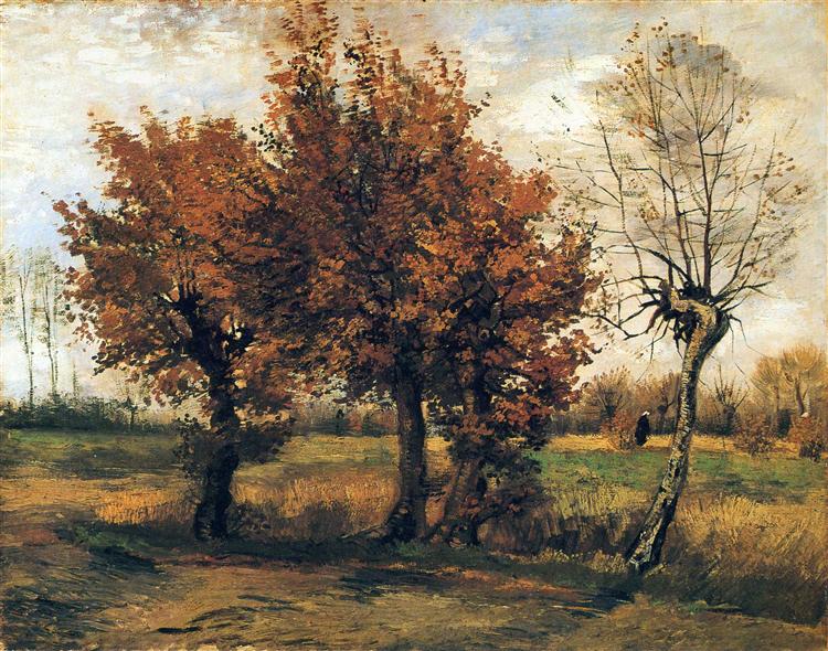
Autumn Landscape with Four Trees by Vincent van Gogh c. 1885 Kröller-Müller Museum, Otterlo, Netherlands
"Autumn Landscape with Four Trees" was painted by Vincent van Gogh in 1885 during his time in Nuenen, Netherlands. The painting is characterized by its realism style, capturing the essence of the autumn season. The artwork predominantly showcases four trees, capturing the essence of the fall season with its changing colors and the atmosphere it brings. The painting is a testament to van Gogh's keen observation of nature and his ability to convey the mood of a scene through his choice of colors and brushwork.
Relation to the Four Qualities of Color Theory:
- Hue: The painting captures the hues of autumn, with the changing colors of the leaves on the trees, ranging from greens to yellows and browns.
- Value: Van Gogh uses varying values to create depth in the landscape, with darker values in the foreground and lighter values in the background, giving a sense of distance.
- Saturation: The colors in the painting are not overly vibrant, reflecting the natural and muted tones of the autumn season. This choice of saturation adds to the realism of the scene.
- Chroma: The chroma in the painting is balanced, with the colors appearing true to the natural landscape of autumn without being overly bright or dull.
Van Gogh's "Autumn Landscape with Four Trees" is a beautiful representation of the fall season, capturing the mood and colors of nature during this transitional period. The painting showcases van Gogh's ability to use the qualities of color effectively to convey the essence of a scene.

Starry Night Over the Rhone by Vincent van Gogh c. 1888 Musée d'Orsay, Paris, France
"Starry Night Over the Rhône" is one of Vincent van Gogh's iconic paintings of Arles at night. Painted in September 1888, this masterpiece depicts the night sky over the Rhône River. The scene was captured from the bank of the Rhône, which was just a short walk from the Yellow House on the Place Lamartine, where van Gogh was residing. The painting showcases the night sky and the effects of artificial light at night, themes that fascinated van Gogh and were subjects for some of his other renowned paintings, such as "Café Terrace at Night" and "The Starry Night" from Saint-Remy.
The painting provides a view from the quay on the east side of the Rhône, looking into the bend of the river towards the western shore. The scene captures the towers of Saint-Julien and Saint-Trophime on the left and the iron bridge connecting Arles to the suburb of Trinquetaille on the right.
Van Gogh's use of color in this painting is particularly noteworthy. He described the composition in a letter to his brother Theo, mentioning the aquamarine sky, the royal blue water, the mauve ground, and the town in shades of blue and purple. The gas lights are depicted in yellow, with reflections descending in russet gold to green-bronze. The Great Bear constellation is painted in sparkling green and pink, contrasting with the gold of the gas lights. In the foreground, two colorful figures of lovers can be seen.
The painting is a testament to van Gogh's fascination with the night and his ability to capture its beauty and mystery. The reflections of the gas lights in the water, the shimmering stars, and the deep blues and purples of the night sky all come together to create a mesmerizing and atmospheric scene.

Café Terrace at Night (Place du Forum, Arles) by Vincent van Gogh c. 1888 Kröller-Müller Museum, Otterlo, Netherlands
Van Gogh painted this scene in mid-September 1888, capturing the ambiance of the café's artificially lit terrace and the surrounding darkness of the rue du Palais. The café, now known as 'Le Café La Nuit', still stands at the Place du Forum in Arles.
Van Gogh was particularly enthusiastic about this painting, as evidenced by a letter he wrote to his sister. He described the scene with figures on the terrace under a large yellow lantern that illuminates the façade, and pavement, and even casts light on the cobblestones of the street, giving them a violet-pink hue. The houses in the background under a star-studded blue sky are depicted in shades of dark blue or violet.
Relation to Color Theory:
- Hue: Van Gogh uses a variety of hues in this painting, from the warm yellows of the café lights to the cool blues and violets of the night sky and buildings.
- Value: The contrast between the brightly lit café and the dark night sky and streets showcases van Gogh's use of value to create depth and focus in the painting.
- Saturation: The vibrant yellows and blues are highly saturated, drawing attention to the café and the sky, while other areas have muted colors, adding to the nighttime ambiance.
- Chroma: The painting exhibits a balance in chroma, with the bright, pure colors of the lights contrasting with the more subdued tones of the surroundings.
Van Gogh's description of the painting in his letter highlights his deliberate choice of colors to convey the mood of the scene. He mentions painting a night scene without using black, relying instead on blues, violets, and greens. The illuminated area of the café is described as pale sulfur and lemon green. This approach to color showcases van Gogh's innovative use of color theory to depict nighttime scenes without resorting to conventional dark tones.

Still Life - Vase with Fifteen Sunflowers by Vincent van Gogh c. 1888 Van Gogh Museum, Amsterdam, Netherlands
"Still Life - Vase with Fifteen Sunflowers" by Vincent van Gogh is part of a series of paintings dedicated to sunflowers. Here's an explanation of the painting in the context of color theory and its significance:
Color Theory and the Painting:
-
Vibrant Yellows: Van Gogh's sunflowers are celebrated for their rich, vibrant yellows. This color choice can be seen as a reflection of his emotional state at the time, representing happiness, hope, and friendship. The yellow spectrum was partly innovative due to newly invented pigments that made new colors possible.
-
Contrasting Background: The deep blue or sometimes greenish background in some versions of the sunflower paintings serves to enhance the vibrancy of the yellow flowers, making them pop out. This use of contrasting colors is a fundamental aspect of color theory, where colors opposite each other on the color wheel enhance each other's intensity when placed side by side.
-
Emotional Resonance: For Van Gogh, color was not just a means to replicate nature, but a tool to convey emotion. The sunflowers, with their bright and warm hues, were meant to convey feelings of gratitude, happiness, and possibly the warmth of his friendship with fellow artist Paul Gauguin, to whom he once gifted a sunflower painting.
Significance:
The sunflower series was significant in Van Gogh's life. He painted them with the idea of decorating the Yellow House in Arles, where he had hoped, Paul Gauguin would come to stay. The sunflowers, in all stages of life from full bloom to withering, were seen as a symbol of the cycle of life. Van Gogh once mentioned that, just as certain artists are associated with specific flowers, he wanted to be associated with the sunflower.
In a letter to his brother Theo, Van Gogh expressed his passion for these paintings, stating that the type of painting changes its aspect a little and grows in richness the more one looks at it. He also mentioned that Gauguin liked them extraordinarily and even referred to the sunflower as "the flower."

Irises by Vincent van Gogh c. 1889 Paul Getty Museum, Los Angeles, CA
"Irises" was painted by Vincent van Gogh in 1889 during his stay at the asylum in Saint-Rémy, France. Within the first week of his stay, he began working on "Irises," drawing inspiration from the asylum's garden. The painting showcases a group of irises in varying stages of bloom, set against a backdrop that ranges from the verdant green of the garden to a clear, serene sky.
Color Theory and the Painting:
-
Vibrant Blues: The irises are rendered in deep, vibrant shades of blue and violet. These colors not only capture the natural hue of the flowers but also evoke a sense of depth and emotion.
-
Contrasting Background: The green background serves as a complementary color to the blue and violet hues of the irises. This use of complementary colors, which are opposite each other on the color wheel, enhances the visual impact of the flowers, making them stand out prominently against the backdrop.
-
Emotional Resonance: Van Gogh's choice of colors often went beyond mere representation; they were a means to convey emotion. The vivid colors of the irises against the calming greens and the serene sky might reflect a juxtaposition of his turbulent emotions with the peace he sought in nature.
-
Influence of Japanese Art: The composition, with its decorative patterning and the way the irises seem to overflow the canvas's borders, is reminiscent of Japanese woodblock prints. The influence of Japanese art on Van Gogh's work is well-documented, and it's evident in his approach to color and composition in this painting.

This painting depicts van Gogh's bedroom in the Yellow House in Arles, France, where he lived for a time. The painting is characterized by its bold use of color, simplified forms, and a sense of tranquility.
Color Theory and the Painting:
-
Bold and Expressive Colors: Van Gogh uses a palette of bold and expressive colors in this painting. The walls are painted in a shade of pale violet, the floor is of red tiles, and the wooden furniture is yellow.
-
Complementary Colors: One of the standout features of this painting is the use of complementary colors. The violet walls contrast with the yellow furniture and the red tiles of the floor and bed covering contrast with the yellow bed and chairs. This use of complementary colors creates a vibrant and dynamic visual effect, making each color appear more vivid.
-
Emotional Resonance: Van Gogh's choice of colors in this painting is not merely representational but also emotional. The warm and comforting colors of the bedroom might reflect van Gogh's need for a place of refuge and peace amidst his tumultuous life.
-
Simplified Forms and Colors: The objects in the room are rendered in simplified forms and colors, which gives the painting a dreamlike quality. This abstraction and the bold use of color make the painting more about the essence and emotion of the space rather than a literal representation.
Significance:
"Vincent's Bedroom in Arles" is not just a depiction of a room; it's a reflection of van Gogh's state of mind and his search for a place of solace. The painting is celebrated for its innovative use of color, which goes beyond mere representation to convey emotion and mood. It's a testament to van Gogh's mastery of color theory and his ability to use it as a powerful tool for expression.

Wheatfield with Crows by Vincent van Gogh c. 1890 Van Gogh Museum, Amsterdam, Netherlands
Created in July 1890 in Auvers-sur-Oise. The painting depicts a vast wheat field under a stormy sky, with a path leading into the distance and a flock of crows flying overhead.
Color Theory and the Painting:
-
Powerful Color Combinations: Van Gogh employed striking color contrasts in this painting. The deep blue of the sky stands in stark contrast to the yellow-orange hue of the wheat field. This use of complementary colors creates a vibrant visual effect, making each color appear more vivid.
-
Emotional Resonance: The menacing sky and the crows are often interpreted as symbols of turmoil and impending doom. The colors chosen by Van Gogh, especially the stormy blues and the golden wheat, might reflect his emotional state at the time, oscillating between turbulence and moments of calm.
-
Path of Intensified Red: The red path that cuts through the wheat field is intensified by the green bands of grass on either side. This is another example of complementary colors at play, with the red and green enhancing each other's vibrancy.
-
Symbolism and Mood: The color choices in this painting are not just about representation; they also convey mood and symbolism. The crows, often seen as omens, combined with the stormy sky, create a sense of foreboding, while the golden wheat field might symbolize life, harvest, or the passage of time.
Significance:
"Wheatfield with Crows" is often claimed to be one of Van Gogh's last works, and there's a persistent myth that it refers to the end of his life approaching. However, he did produce several other works after this one. Van Gogh himself mentioned that he wanted his wheat fields under stormy skies to express "sadness, extreme loneliness," but he also saw something "healthy and fortifying about the countryside."
Conclusion
Vincent van Gogh stands as a beacon of innovation, particularly in his use of color. From the early days of his artistic journey, where the somber tones of "The Potato Eaters" reflected the hard life of peasants, to the vibrant hues of "Starry Night Over the Rhone" that captured the magic of the night, van Gogh's evolution as an artist is evident. His works, whether they depict the tranquility of his bedroom in Arles or the tumultuous emotions evoked by a wheat field under a stormy sky, are a testament to his mastery of color theory.
Van Gogh's paintings are not just visual feasts; they are emotional journeys. His use of complementary colors, his understanding of value and saturation, and his ability to convey mood and emotion through color choices make him a pioneer in modern art techniques. His deep connection with nature, his admiration for other artists, and his personal explorations all contributed to his unique approach to color.
In "Wheatfield with Crows," the foreboding sky and the golden wheat field encapsulate the duality of life - the impending storms and the golden moments. Similarly, in "Irises," the vibrant blues and violets against the serene green backdrop capture the beauty of nature in full bloom. Each painting, with its unique color palette, tells a story, evokes an emotion, and invites the viewer to delve deeper into van Gogh's world.
In conclusion, Vincent van Gogh's exploration of color was not just a technical endeavor but an emotional one. His paintings are a reflection of his inner world, his struggles, his joys, and his endless fascination with the world around him. Through his innovative use of color, van Gogh has left an indelible mark on the world of art, teaching us that color is not just a visual element but a powerful tool for expression.